
Introduction
VIPKID is a series D education startup valued at 4.5 billion USD and headquartered in Beijing, China. The main company, VIPKID, connects English teachers from around the world with students in China who want to learn English. VIPKID also has other various sub companies like Lingo Bus which connects Chinese teachers from China with students around the world who want to learn Chinese, and SayABC, which is where I worked at. When I joined SayABC, the sub company had just been started a few months ago.
My role
I worked as the sole UX designer leading the UX in the design team. I designed products among many different mediums, from iOS apps, desktop platforms, websites, and WeChat mini programs.
Customer insights & ideation
Even though there was no history and culture of doing user research in the company, I took the initiative to plan and conduct several generative research interviews with our users for the SayABC teaching platform with an intern assisting me. The report was later shared by the boss to the whole company.
Experience strategy & vision
I made prototypes and vision designs to evangelize with the product and design team and to highlight what new potential features we could include.
design evangelization
I evangelized the value of ideation and by using Google’s crazy eight exercise. The senior PM was so taken with it that he asked everyone in a senior management meeting to do the exercise. The boss argued saying that the problem they were trying to solve was simple, but the senior PM continued to push for it. At the end of the exercise, the boss really like the ideas that were generated and admitted that he was to hasty in labeling it as a waste of time and that the exercise did generate value.
design process creation
I advocated for the design team to make a design style guide, and to have the style guide be maintained in a sketch symbol library. There were different levels of adoption of using symbols in sketch files which led to time being wasted, and the visual style of the product changing depending on which designer designed that section.
I also advocated for a ways of working with the PMs and UI designers. Only one of the senior designs had worked with a UX designer before, so I established a ways of working with the seven other PMs in the team. Many times PMs would come to me with the full design done and expect me to do the wireframes. In addition, when I would ask why they want this new feature, and what the goal of the feature was they would not know. As a result, I helped to establish a process where PMs would engage with me earlier on, where we could collaborate together on what we thought was the best idea.
planning & scope definition
I would advocate for the user with the PM during planning sessions, while keeping in mind business goals.
oversight & coordination
I had to coordinate with 8-10 different PMs and juggle designs for different platforms.
design execution and validation
I designed user journeys, wireframes, and prototypes for both platforms, web, and the company WeChat miniprogram.
leadership
I advocated for the user and on the importance of user centered design throughout senior management in the company.
constant Product improvements: volume control
total time
2 Weeks
background info & Problem
Most of my time was spent on new features and product improvements that could be completed in the process of one sprint. This volume control feature was just a snapshot of one of the many features we implemented as a team. There was a twofold problem of a noisy background environment and/or students not wearing headphones and using their speaker on their laptop/iPad, which led to their mic picking up the classroom sounds and disrupting the class for everyone.
The Goals
Decrease background noise by 25%
Empower teachers to control the classroom better
Design constraints & challenges
Design process challenges due to the immaturity of UX in the company and was in a constant state of being worked out
Time constraints around gathering qualitative feedback from teachers and students
Establishing the importance of the ideation phase in the design process
Establishing a design language for consistency among all platforms (mobile, PC, ipad)
Constraints about what could be done to the classroom due to the code base
ideation
My first thought was to think about how already established voice calling software already implements volume equalizing. However, since we did not have a volume control feature at the time (teachers could only mute students), if would not have been possible to complete that within one sprint. As a result, I proposed a three sprint plan with the PM. In the first sprint, if a student’s volume exceeded the rest of the students after a period of time, the teacher would receive a notification on their app reminding them that they could mute their student’s volume if it is too loud. The second phase would implement a volume control where teachers can lower or raise a student’s volume. The third phase would be an automatic volume adjustment done in the backend so that teachers could focus on teaching.
I wanted to offload as much of the cognitive process to the system and backend because I knew from speaking with past and current teachers and that they have a lot on their mind already when they are teaching. They need to take into consideration their pacing, the engagement of their student, following the teaching material, and various other things. As a result, I wanted to focus on a solution that would be as close to automated as possible.
wireframes
After the ideation session, I mocked up the notification and the volume control slider and then worked with our UI designer for the final design. I decided to have the notification come from the mute button because they both had to do with volume. In addition, the teacher has to know which student has the loud background noise. Since the action was a more severe action, I did not want to automatically mute the student, but instead alert the teacher to a potential background noise.


Results
There was a substantial drop in background noise after the notification was implemented. In the picture below, background noise dropped from around 8-9% for trial and regular classes, to around 4%.

8-9% background noise to 4% background noise in all classes from 2017 week 41 to 2017 week 44.
Concluding thoughts
The notification was first implemented into the teacher client and the volume slider was only implemented much later, just as I was about to leave the company. If there was something I could have redone it would have been to push harder for the introduction of a volume control. Later on, when I was working on another project, a few teachers gave me feedback saying that they wished that there was a volume control setting.
TEacher Client Redesign
Total time
4 Weeks
background info
SayABC had only been recently created by VIPKID for a few months before I joined them in June 2017. The teacher client that was designed was very lightweight, and was not designed with scale in mind with regards to new features. I worked with a PM and a UI designer on this project, and also had an intern assisting me. This project also lasted over a period of time because it was put on hold for about six months in between the first sprint.
The goals
Provide users with an overall view of their account
New design had to be scalable to be able to add new features to the client
Design constraints & challenges
Design process challenges due to the immaturity of UX in the company and was in a constant state of being worked out
Time constraints around gathering qualitative feedback from teachers
Time constraints around design work for such a large project
Project being put on hold after one sprint
Establishing the importance of the ideation phase in the design process
Establishing a design language for consistency among all platforms (mobile, PC, ipad)
Difference in information architecture between users in China and users in the West
initial design process
I initially only had one sprint’s worth of time to redesign the whole teacher client, and to add additional features to the app. I had already done a cognitive walkthrough of the client app when I first entered the company, so I had several hypothesis with regards to what features our users would like to see.
Users want to see their upcoming classes
Users want to see the tasks that they need to do
Users want to be able to see their schedule
Users want to be able to quickly reach support
Users want to be able to get updates on news that personally affect them
Therefore, I went with a dashboard design to be the first thing that users would see when they logged in. Furthermore, I could tell that the information hierarchy of the design at that time was not scalable to be able to accommodate all the additional features that Product and users would want. However, after coming up with a design, this project was put on hold for around six months. The initial design I had in mind was a dashboard view where information would be organized based on most important to least important, and from most urgent to less urgent from left to right, top to bottom.
while on hold - Research
While the project was still on hold, I decided that I would not be constrained by sprint time limitations and to take the initiative to do research on my own. I decided to do interviews with our teacher users because of my familiarity with the teacher platform, and my English being much better than my Chinese.
I started out by conducting interviews over Skype with 7 teachers with SayABC. I had two goals that I wanted to achieve, one at a high level and one more specific. Firstly, I wanted to understand the full life cycle that a teacher had with SayABC, from why they applied to SayABC, the interview process, teaching their class, interactions with SayABC support, and all the way to their current day. Secondly, I wanted to get a more in depth understanding of how they use the app, and what specific pain points they had regarding the teacher client.
I first set up a structure of questions I wanted to ask, from questions about their overall experience with SayABC, to diving deeper into the details about their experiences using the teacher client. I was able to find out several key items and divided the data I received into several sections: Logistics, Communication, Class prep, Reward system, Teaching, Classroom, and Curriculum.
Logistics was where users were unclear about teacher logistical matters like salary, career progression, and knowing how many hours had been taught so far.
Communication highlighted a problem with communication between the SayABC teacher management staff and the teachers themselves.
Class preparation highlighted the technical bugs in the system, and timing issues with the curriculum.
Reward system highlighted the fact that the in class reward system was no longer delighting the students.
Teaching highlighted the lack of feedback that teachers received on their class.
Classroom highlighted the bugs and technical issues with the classroom.
Curriculum highlighted how some students did not fit their curriculum level.
Full report here
back on track - Ideation & wireframes
After six months, the project came back online. I was able to look at the research I had done, and after analyzing the results, I was able to validate features like teacher scheduling and communication with the teacher management staff. While there were some features we did have to add, the designed features would help address some of the concerns of the users.
Next, I then did an analysis with my intern on whether the design done previously would be able to work with the few extra features that users wanted. After that confirmation, we then started to ideate on the information architecture and user flows of the client by drawing up options on the whiteboard.
During this whiteboarding session I divided the client up into several parts. Firstly, there was the dashboard where teachers could get a birds eye view of their upcoming classes, important tasks left to do, salary, communication from teacher management, and other things. Secondly, there were the classes, academy, and time slot pages, where teachers were able to view their classes, learn new skills and lessons, and sign up to teach classes respectively. Thirdly, there was the my profile section where teachers were able to put in their profile information. Lastly, there was the notifications and help & support systems that had to be designed and thought through.
After this, I started to whiteboard the individual pages on a more detailed level and then started wireframing.

Link to full wireframes are here


From what you can see above, the dashboard was designed to show upcoming classes, things to do, a weekly schedule, income, communications and support. The goal was to add more features so that teachers would not need to log into the teacher’s website, but rather be able to do those same features like signing up for classes in the client itself. The communications section came from speaking with several teachers who highlighted the lack of communication between teacher management and the parents with the teachers. As a result, I wanted to design a place where teacher management could notify teachers about upcoming events. For example, one teacher told me that for Halloween his student dressed up as a witch. If the teacher had known, they would have done something to dress up.
I also did another iteration of the dashboard for the future to include a career progression system. There were some teachers who were really interested in knowing how to climb and to make this a career not just a job. As a result, I thought of a system where teachers can have a teaching rank, and they can level up that rank by teaching classes and getting good feedback. I was also thinking that senior and experienced teachers could mentor new teachers and teach them what they have learned from experience.

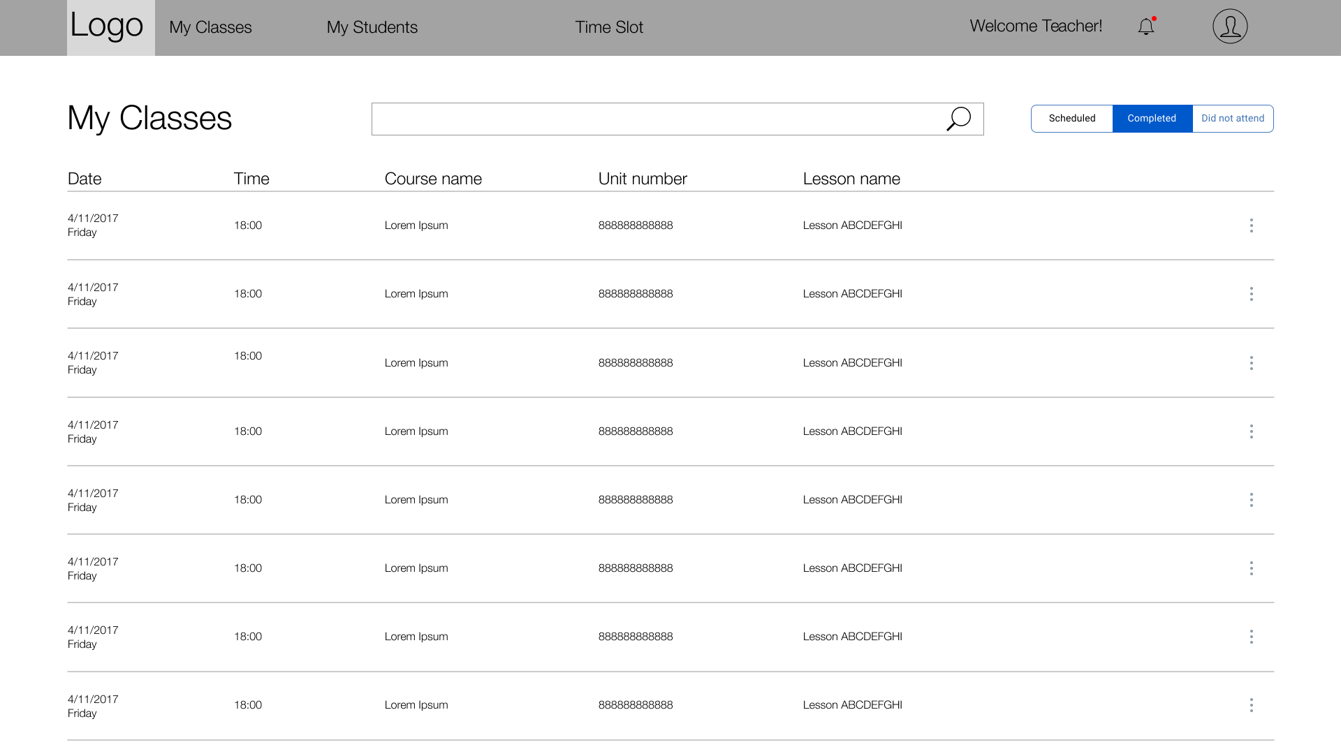

The My Classes page was a list of all the classes a teacher has completed, did not attend, or have upcoming. This is also where teachers would go to complete their class feedback for students and take attendance. Since this was going to be a big redesign, I followed the logic of the old design having scheduled and completed classes as a tab to switch between. This was to reduce the learning process for the teachers. Similarly, I placed the action buttons on the right hand side of the screen.


The my students page was a page where I had a disagreement with the senior PM the project. The PM wanted to have a student section where all the students would be listed. However, I argued against that because firstly, teachers would not be able to remember all the students, and secondly, many students had the same English name as one another. We came to a compromise by having me add a student list that was arranged by class, so that teachers would at least be able to remember which class the student belonged to. Then for the student list I arranged the students by when they had a class with the teacher.
Later on, in the final product, I was able to convince the senior PM that the student page was not needed, and it was removed from scope.
The link to the full set of wireframes are here
final product
After the wireframes were completed, I worked with the UI designer to begin work on version 1 of the visual design which went live. I do not have the visual screens of version 1, and only have the screenshots from version 2, where there are some deviations and changes from the original wireframes and visual design. However, even version 2 showcases the difference between the original and the new designs.


Results
After the new design went live, I received some feedback on Skype from our users. Here are some of the following comments from some users:
“Its awesome, I really like the new interface. Its definitely more user friendly than previous versions of the portal.”
“I think the platform is great actually”
Concluding thoughts
I was satisfied with how the design turned out due to the challenges that came up during the design process. There were many challenges like the lack of time for research in the first sprint, the project going on hold, and disagreements over the information architecture of the app, to name a few.
However, there were several things I would have changed if I had the resources to do. First, I would have done a card sort for the IA. This would have eliminated the the disagreements over the IA of the app and have allowed me to be more efficient. Second, I would have interviewed more users to get a better understanding of their needs, the tasks that they have to accomplish, and their usage habits of the client. And third, I would have created a prototype and done a usability test before the redesign went live. Fourth, I would have asked users in the research I did to rank the most important to least important features to them. And fifth, I would have done an ethnographic study to watch how teachers prepare for classes in the their homes. Sixth, I would do a qualitative study into how and when teachers complete their student and class feedback to see if it needs to be its own section, or if there is a better entry point for it.
wechat miniprogram
total time
2 Weeks
Background Info
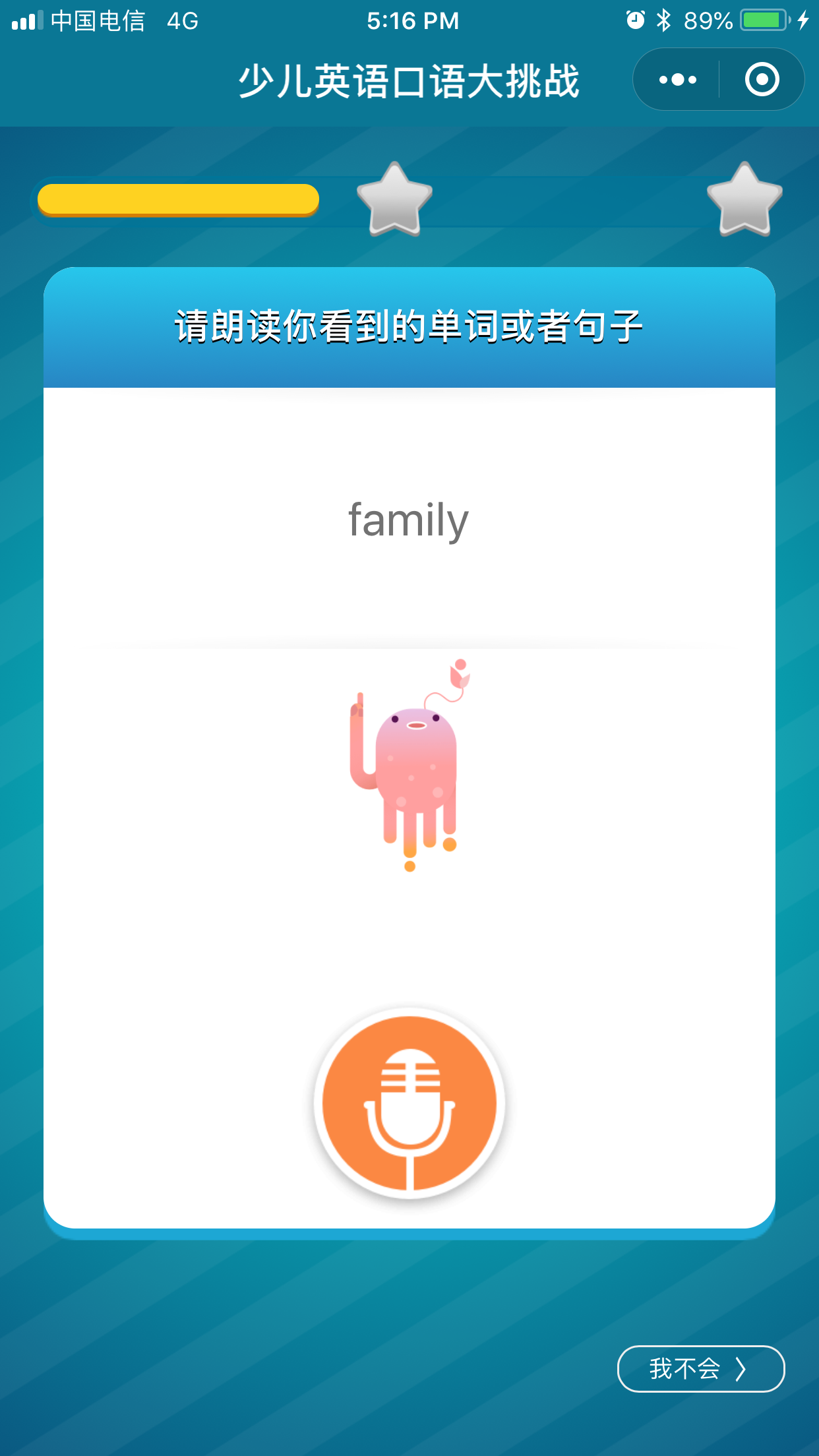
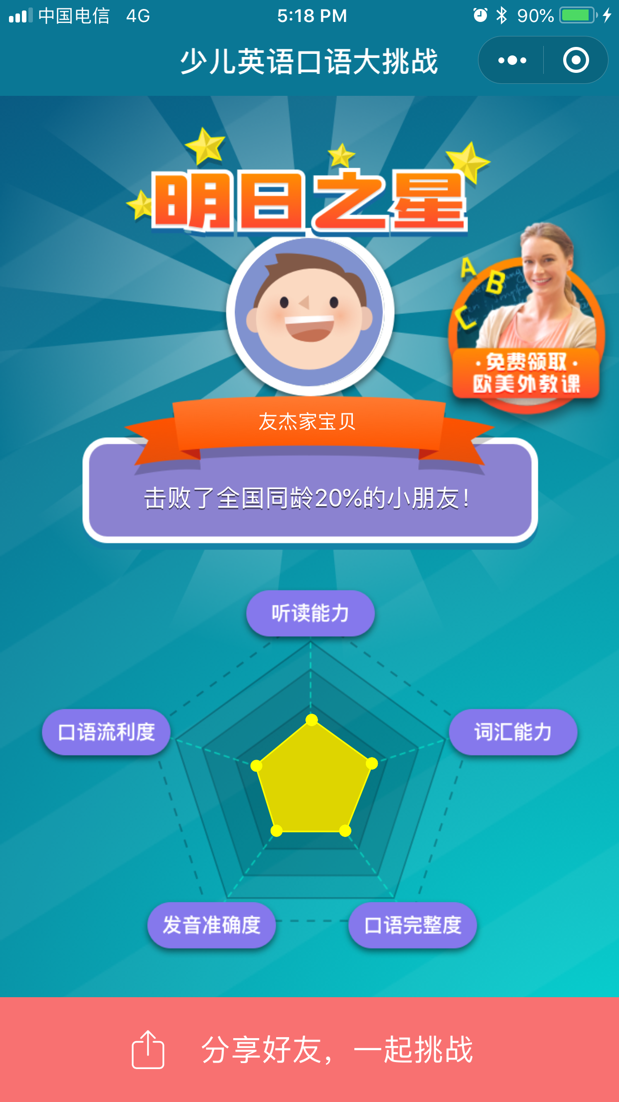
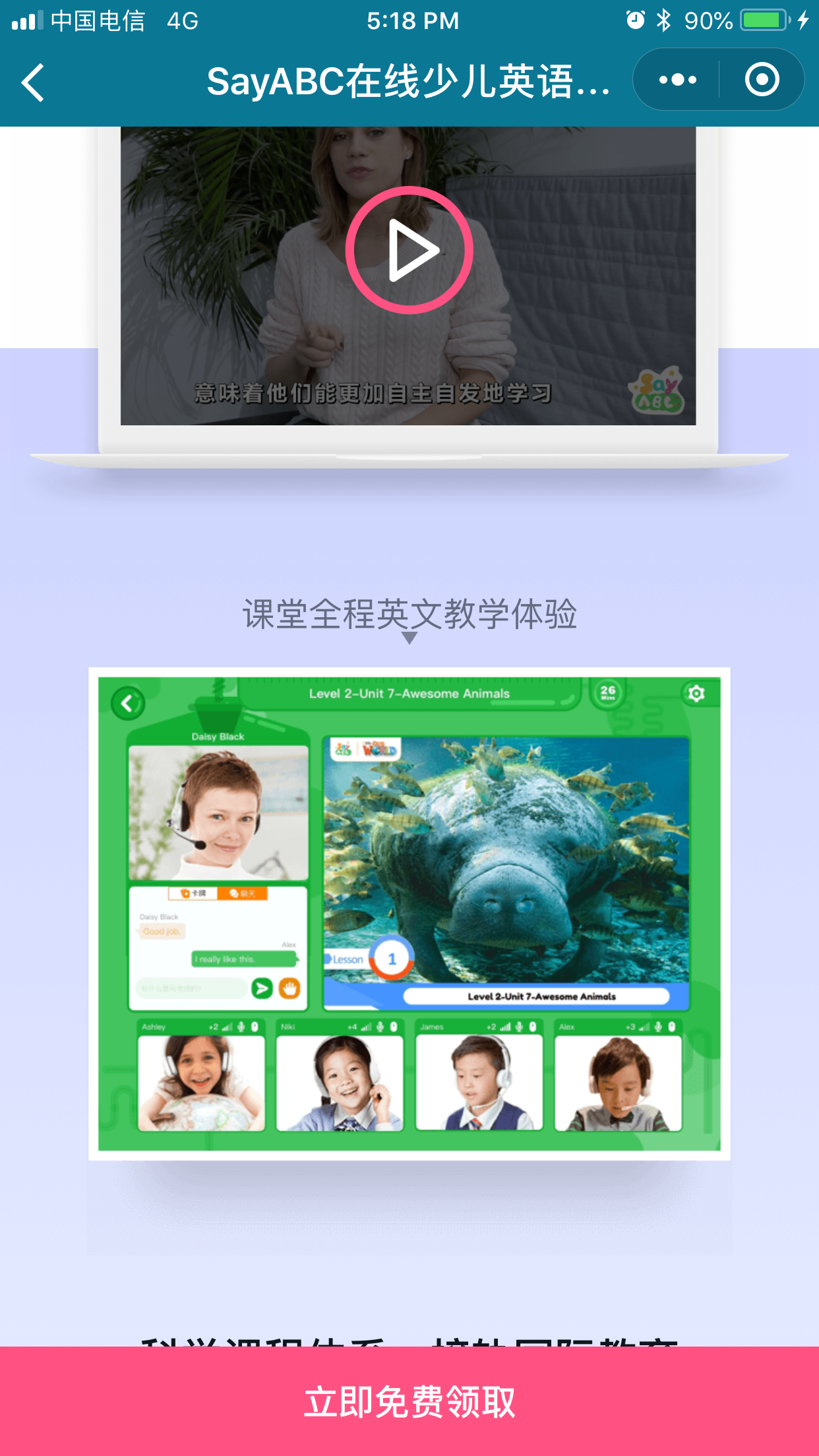
WeChat started out in China as a messaging app and has evolved to be the most widely used super app in the world. You can order food delivery, book a flight, pay for meals with your e-wallet, book a train ticket, donate to charity, pay your utility bills, and more more things. Mini-apps are mini-apps that exist on the WeChat platform that companies can create. The SayABC leadership team came up with an idea to create a WeChat miniprogram quiz in order to generate interest in the general public about the company. They wanted to allow users to be able to test their English skills and then at the end give users a breakdown on a categorical basis the level they are at, and the level of the course at SayABC would be best for them. The goal was to have a fun mini-app where the whole family could test themselves and their friends.
There were a few hurdles along the way. Firstly, there were a few individuals who wanted to put a portion of the sign up before the quiz. I fought strongly to put collecting an individual’s information after the quiz to hook the user in first. Secondly, I pushed for an added “coolness” factor to the miniprogram in order to differentiate itself and make it unique. This resulted in the addition of the use of voice and being able to score users on their English speaking skills.
Design constraints & challenges
Design process challenges due to the immaturity of UX in the company and was in a constant state of being worked out
Time constraints around gathering qualitative feedback from parents and students
Establishing the importance of the ideation phase in the design process
Establishing a design language for consistency among all platforms (mobile, PC, ipad)
Ideation & Wireframes
I first started by doing a competitive analysis by looking at several quiz apps on the app store and noting the things that they did well, and the things that could be improved. From there, I moved on to doing several whiteboard sketches and then bouncing ideas off of the PM working with me on the project. Then, we worked with the curriculum team to select the different type of questions we wanted to ask, and the specific details of the content of each question and their answers. After this I then started wireframes.


Results after 24 hours
New orders: 391
Amount made: Over 1 million RMB ($144,450USD) made through renewals and new orders
China News, the second biggest government news agency in China, wrote an article about the product here
Marketing campaign
Total time
2 Weeks
Background info
There was an idea for a marketing campaign to do a group bundle similar to Massdrop. This idea came from a newly popular e-commerce app in China called PinDuoDuo. Although I was no longer a part of the company when the marketing campaign launched, I was involved in helping to ideate and give UX guidance on the product in addition to doing wireframes.
Design constraints & challenges
Design process challenges due to the immaturity of UX in the company and was in a constant state of being worked out
Time constraints around gathering qualitative feedback from parents and students
Establishing the importance of the ideation phase in the design process
Establishing a design language for consistency among all platforms (mobile, PC, ipad)
Understanding the PinDuoDuo context and whether it would fit for the marketing campaign
Ideation & wireframes
I first began the ideation process by looking at group buying websites like PinDuoDuo, Massdrop, Groupon, and several others. Each website had a slightly different logic to group bundles and I spent the first few days debating with the PM and a design intern over what the best bundle logic would be. After we decided, I then started to wireframe up the marketing page.

Link to full wireframes here
final product


Results after the 1 hour campaign
Number of transactions: 6820
Amount made: 23 million RMB (USD$2,748,325)