
Crowdstrike: Ecommerce Checkout Flow
Results
Financial Impact: The redesign drove a 42% increase in quarter-over-quarter revenue.
Usability Success: Achieved a 100% task completion rate in usability testing, with no reported friction points.
Background and Business Context
CrowdStrike had secured its position in the enterprise cybersecurity market. The next growth target was small and medium-sized businesses, a segment with high potential but different buying behavior. The sales team was structured for high-touch enterprise deals, not for the volume and speed that SMB transactions demand. Scaling headcount was not feasible, so leadership set a clear challenge: build a self-service ecommerce channel that could handle SMB purchases end-to-end without requiring a salesperson.
My role was to design the checkout flow that would make that possible. Success meant opening a new revenue stream. Failure meant SMB buyers would default to competitors with faster, easier buying experiences.
Understanding the User
The primary audience was software procurement professionals in SMBs. They often have multiple responsibilities and limited time to complete purchases. One test participant, an IT manager at a 50-person firm, summed it up during early interviews: “I just need to get this purchase done before lunch. I don’t want to read a manual to figure it out.” That sentiment became a guiding principle throughout the project.
Constraints and Challenges
Evolving Priorities: Cart features were delayed, new payment options were introduced mid-project, and requirements shifted frequently.
Team Changes: The UX manager left during the redesign, and we needed to get up to speed quickly on Chargebee, our payment processor.
Multiple Stakeholders: Input came from two marketing teams, engineering, and product, each with different goals and priorities.
To navigate these factors, I kept designs adaptable and facilitated alignment across teams so we could maintain momentum despite moving targets.
Competitive Research and Design Approach
From the outset, I was not looking to invent a new checkout paradigm. For SMB buyers, predictability and speed matter more than novelty. I analyzed leading ecommerce flows including Shopify, Clover, and eBay, focusing on how they reduced cognitive load and guided users to completion.
Shopify’s all-in-one, linear flow stood out as the most effective pattern, especially for mobile. It required minimal context switching, kept progress visible, and had been validated at scale. I presented Shopify’s live experience to stakeholders, showing how its structure aligned with our goals. This made it easier to secure buy-in for a similar approach adapted to our brand and technical requirements.


2. All-in-One Layout: Chosen for its straightforward, linear flow, particularly effective on mobile devices.


3. Sidebar Layout: A more innovative approach, later discarded due to project scope changes.


Selected Design: The All-in-One Layout was chosen for its intuitive progression and mobile device compatibility.
New customer
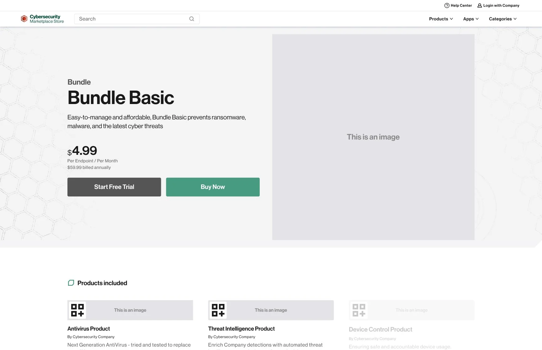


Existing customer


Navigating Stakeholder Input
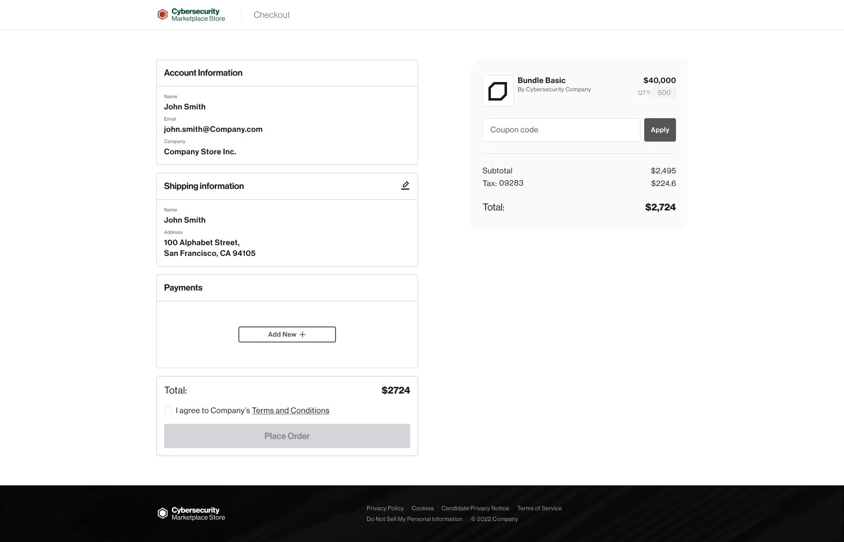
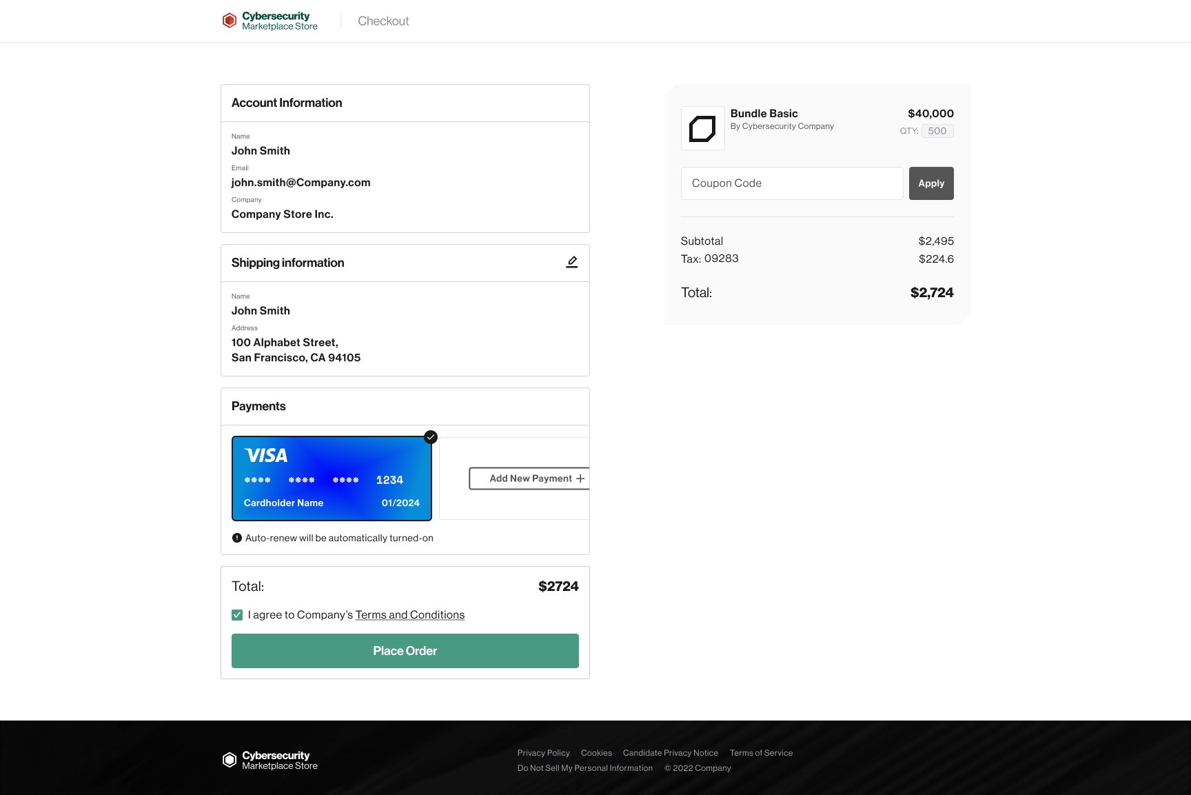
One design discussion focused on the credit card entry step. I recommended a clean, minimal treatment similar to Shopify and eBay, using small icons to indicate card type without distracting from the form. The Director of Product preferred large, decorative credit card images for a more branded visual impact.
I presented competitive benchmarks and mobile usability considerations to support my recommendation. Ultimately, we moved forward with his preferred design to maintain alignment and keep the project timeline on track. The experience still met our usability goals, and the process reinforced my understanding of how to balance evidence-based design choices with broader organizational priorities.
Outcome
The final flow served both new and returning customers with clear, direct steps. New customers could create an account, enter shipping and payment information, and confirm their order without unnecessary detours. Returning customers could verify details and complete a purchase in fewer steps.
Reflection
This project underscored the value of adaptability in design work. Borrowing proven patterns was not a shortcut but a deliberate strategy that respected user expectations and reduced risk. I also learned that design decisions exist within a larger organizational context. Advocating for the user is essential, but so is knowing when a trade-off will protect timelines and relationships without compromising core usability.