
Introduction
Publicis Sapient is a digital consultancy firm specializing in digital business transformation. During my time here, we helped Mercedes Benz transition their Chinese website from a multiple, fragmented website experience to a single united website experience. The strategy and purpose was to integrate existing car owner websites like Mercedes Me Connect and the Mercedes Me Portal, into the main consumer facing website. In addition, the purpose was to have reusable design components through Adobe Experience Management, thus reducing the amount of design effort.
Phase one was designing the public facing parts of the website, and phase two was the purchase process and the owner section of the website. When I joined, phase one had just ended and phase two had begun.
My Role
While at Publicis Sapient, I worked as the UX designer in a team consisting of a BA, UI designer, Frontend developer, and a PM.
design process
I advocated for the design team to have a design critique when there was none before.
I also advocated for a unified Sketch symbol library.
design execution and validation
I designed user journeys, wireframes, and prototypes for a responsive website.
Customer insights
I would periodically check the website’s analytics and see what could be improved.
Experience strategy & vision
I would show the client how designs could be scaled for the future.
leadership
I led the effort in my team to advocate for the user while keeping business goals in mind.
Client management
I met with clients at the beginning of each sprint to gather requirements and understand what the business needs and goals were. After the design was finished, I would present the finished designs to the clients for feedback.
Car Comparison
Total Time
2 Weeks
Background info
The Mercedes Benz China website did not have a car comparison feature which the client wanted to add to the website. The requirements were to allow users a single space where they could compare cars from among all models. This was also validated by a usability test run earlier, where users indicated that they wished to see a comparison between different car models.
Goals
Business goal: Allow users to compare all cars which would drive buying purchases up
User goal: Empower users to be more informed when making their purchasing choices
problem being solved
What is the best way to enable users to be able to compare cars with each other?
User Data
Based on research and user segmentation, users who visited the website fit one of four main segments: private car purchasers (M: 55% / D: 57%), company car purchasers (M: 6% / D: 7%), owners (M: 20%, D: 16%), and Enthusiasts (M: 19% / D: 20%). 25% of all users plan to purchase within 6 months, while 50% of users have no purchase intention. This feature would be catered for the private car purchasers segment.
Research
I did a competitive analysis of different websites to understand the strengths and weaknesses of each. Some of the car websites I looked at did not have a car comparison feature while these four did: BMW, VW, Audi, and Jaguar. I also analyzed the item comparison from the Apple website. I found out the following things:
Not all car websites allowed for comparisons between all car models
All websites had a selection action first and then results after
All websites had a grid results design
BMW does not allow car comparisons for all models, just within one model itself
Audi allows users to compare two different models
Jaguar has a long flow of vehicle —> model —> engine and then the user has to add another vehicle —> model —> and engine.
VW has a model —> engine selection flow
Apple did not have a second selection layer, just the model selection.
Design constraints & challenges
Had to reuse existing components as much as possible
Some entry points to the car comparison page came from the car model level but cars could only be compared at the car engine level
Multiple pixel perfect UI iterations
The sprint begins - Ideation
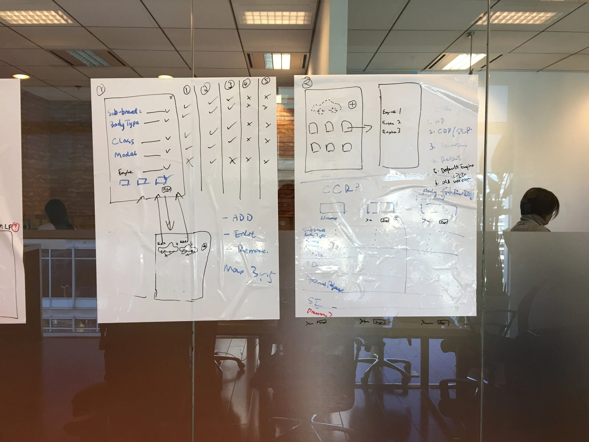
I started ideating by sketching out the flow out on the whiteboard and discussing it with the other people in my team. I looked at the flows of the other websites that I looked at in my competitive analysis and then settled on the simplest one for the user. My goal here was to reduce any amount of cognitive load and to make it as intuitive as possible. These were the things I had to think about and consider:
Which component / design should I use for the model selection?
How will the engine selection look like?
How many cars can the user compare?
How will the flow work?
I also started to sketch different ideas I had for the car model selection page and also how the engine selection would work in the context of the constraint of reusing components as much as possible.


So far so good - wireframes
After sketching out some ideas, I wanted to move on to wireframing some of the better ideas to flesh them out in more detail.
First, I wanted to wireframe three options for the car model selection from the ideation process. The first option was to resuse the all vehicles page on the website, the second option was to reuse the download vehicle brochure component, and the third one was a new component that I was personally considering as an option.

All Vehicles Component

Download Vehicle Brochure Component
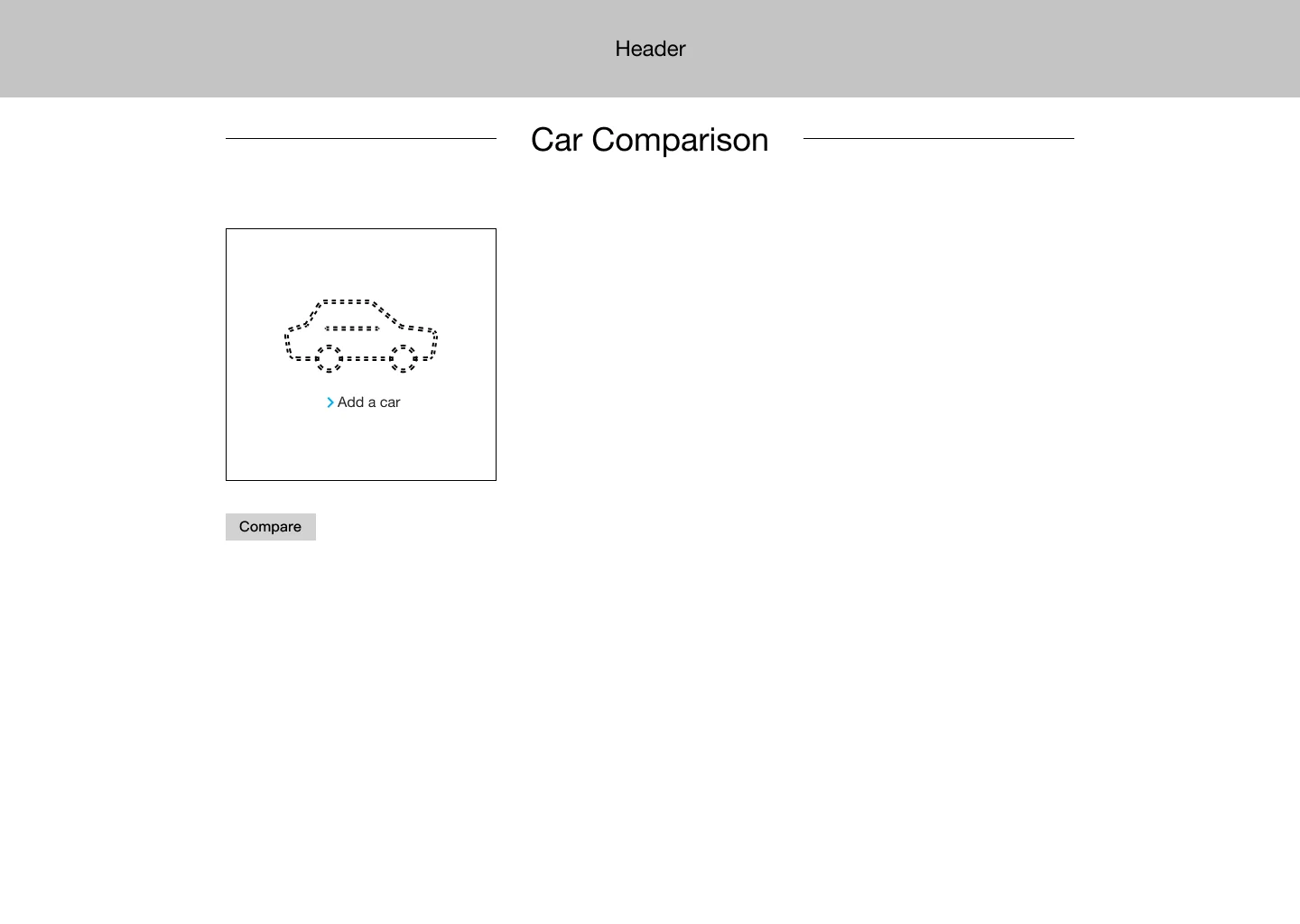


I decided against the all vehicles component because the interaction logic did not fit with the purpose that the user wanted to achieve. The user has to make a car model selection, and the all vehicles component did not support this.
The goal of the third option was to combine both the car selection process and results into one page which would reduce the number of steps for the user. There were three main options I could have taken for the car selection interaction. First was the current car selection component. I decided against it because it would make the page very long for the user since Mercedes has a lot of models. Second option was having the user make the car selections in a popup window. I decided against this because of space limitations for mobile since the site is responsive. As a result, I went with the third option which was a new component where users could make the car selections in page. However, in the end, I decided against a single page for the following reasons. First, it would increase development time and increase the risk of not making release especially when the other team had spilled over for two sprints. Second, I believe in the principle of never giving a user too much on one page that they can cognitively process due to the amount of decisions a user had to make in the selection process. Third, the client had expressed a preference for allowing users to compare up to four cars on the page. Thus, I believed the better solution was to separate both the car selection and car results page.
I chose the car model selection with the bar at the bottom because I wanted to tweak the bar design to allow users to see their car selection at the bottom. In addition, I wanted to allow users to be able to quickly clear a selection at the bottom. Having the selections at the bottom would also reduce the cognitive load on users, as they would be able to see their selections all the time.
rethinking through the engine selection interaction and flow
At first, I had thought there needed to be a separate engine selection page due to cars only being able to be compared at the engine level and this page would work with the all vehicles component.

However, after doing a cognitive walkthrough, I decided that a popup for an engine selection would be best with the model selection component for two main reasons. Firstly, I wanted to reuse components as much as possible because of constraints from development and being on two week sprints and having a popup allowed us to use the download brochure component. Secondly, having a pop up would keep users in the context of the car comparison page, and changing their car model selection would be a far simpler process as the user would not have to reload a new page. Thirdly, the popup worked very nicely with the download brochure component.

Results, results, results
The last thing I designed was the results page. There were several tasks that I hypothesized that users wanted to do on the page from doing a cognitive walkthrough.
As a user, I want to be able to see my results in a clear way
As a user, I want to be able to choose between seeing only differences or everything
As a user, I want to be able to easily clear a selection
As a user, I want to be able to change a selection easily
As a user, I want to be able to action on one of my selected cars
As a user, I want to be able to share this comparison with others
As a result, I arranged the results into a four column grid system, with the top being stickied to the top so that users would not lose context for which car they are comparing when they scrolled down. In addition, I wanted users to be able to clear a selection or action further on a car by scheduling a test drive or starting the purchase journey.
I also had to think about how to showcase the large amounts of data. Each car has data points classified into the following groups:
Basic information
Outside details
Car functions & features
Inside details
Safety details
As a result, user would have to look through 100 - 200 different data points and so I advocated to hide the other groups and only have the basic information open. This would satisfy the casual user while allowing more passionate users to get into the details.

Putting everything together - UI Design
After the wireframes, I worked with the UI designer to finish our first iteration and then we presented the designs to the client. After some UI changes to the grid and adding the view different / view all feature, we then met with the client again and had the design signed off.
Design Sign-off - Final design


final results
In the past, the client was hesitant about adding popups to the website. However, with this in mind, I made sure to highlight my thought process and the reasons for why I thought it was the better design solution here. The client agreed with me and we were able to get sign off on the design after some minor UI changes.
For the time period of January 1st, 2019 - June 30th, 2019, car comparison had 2.5% of all page visits, with 962,396 visits. 30.76% of users went on to a car campaign page, 23.3% of users exited the site, and 6.77 went to the special offers page. Most importantly, 1.8% would go on to the purchase order page, and specifically in the month of June, 2.5% of users would go on to the purchase order page.
Additionally, every year Mercedes has a research firm conduct a website assessment. The 2018 report conducted with a survey with 1,000 people, and conducted a usability test done with 116 people over a 3 month long period. The study went over the usability of the features in the website and had this to say about the car comparison feature:
The tool itself is intuitive to use and offers a comparison of tech specs as well as various types of equipment even including a function to only display differences between model versions.
In addition, the study found out that the car comparison feature is the 8th most relevant feature for users, with 31% of mobile users giving a rating of high relevance and 39% of desktop users giving a rating of high relevance.
They also pointed out three main areas that could be improved:
Increase entry point visibility
Add pricing to the selection stage and links to getting a quote on the results page
Allow users to compare at the model level and not just at the engine level
concluding thoughts
I would have done a few things differently if I had the resources. Firstly, I would have done more research with users to determine what they are looking for when they compare vehicles. I would look to answer questions like, “What if users wanted to compare more than the engine?” and “Do they know enough about the vehicles to select vehicles to compare?” Secondly, I would have done a research study to understand user satisfaction rates after using this tool. Did they find out what they were looking for? If not, what were the pain points? Thirdly, I would have improved the visibility of the entry point on the model overview page and make it more prominent. Fourthly, I would add in more information in the engine selection popup to explain to users the differences between each engine because of the large amount of car models Mercedes-Benz has. Lastly, I would take a deeper look into reducing the exit rate of the page and run an A/B test with a new engine selection interaction design.
The car comparison page can be viewed here.
roadside assistance
total time
2 Weeks
background info
Roadside Assistance is where Mercedes car users can request for help when they get into mechanical problems or accidents. For this project, Mercedes China wanted to move their Roadside Assistance feature from their old website to the new website.
goals
Business goal: Migrate the feature over from the old website to the new one
User goal: Make the process as quick and easy to understand as possible due to user most likely being in a state of shock / anger / irritation / annoyance and so on
design constraints & challenges
Roadside Assistance exists on multiple platforms
WeChat
Hotline
In-car button (not supported by older car models)
Web
Mobile App
Roadside Assistance on web had the lowest use case, around 6 per month
Had to reuse existing components as much as possible
Multiple pixel perfect UI iterations
stakeholder interviews
As with the beginning of all sprints, I went with the BA to conduct stakeholder interviews to understand what the business requirements were, and to get as much context about the feature as possible. I needed to know things like how the current flow was being done, the requirements for submitting a request, the current pain points, technical constraints, and various other things.

problem being solved
Due to a higher chance of a user being in a negative state of mind while using this feature, how can this process be made as quick and easy to use as possible?
adhoc persona
Due to the short time frame and specialized nature of this feature, I created a task based adhoc persona around submitting this Roadside Assistance as quickly as possible. I did a cognitive walkthrough to asses the various mental states that the person could be feeling from shock, confusion, anger, annoyance, irritation, relief, and many others in order to get a grasp of the urgency of the situation and how important it would be for the feature to be quick and easy to use.
Understanding the old flow
First, I went through the old flow to understand the process and then started to identify areas where improvements could be made. I was able to see that three different steps were not required and reduce the amount of steps from 8 steps to 5.

Checking with global and other sites
I also checked out how the global and the US website handled this scenario. The roadside assistance feature on the global website was the same as on the old Mercedes website, while the US website did not have the Roadside Assistance feature. Instead, they had a download app button for all the car connectivity related features. The US team made the design choice that users were not going to use the website to request for roadside assistance, but would rather use other provided platforms with which to request for Roadside Assistance.
As a result, I went to the stakeholder with a solution that I thought made the most sense from a business and user stand point: display the hotline number so that users can tap and call immediately. The stakeholder agreed with me, but we were both overruled by his boss.
ideation

Next, I started drawing different ideas that I had on the whiteboard while keeping in mind the new flow and the adhoc persona. There were several questions I identified and had to think through while whiteboarding such as:
In light of wanting to take as much cognitive load off of the user as much as possible, in a multiple car scenario, how will car selection look like?
Favorite car? What if the favorite car has not been set? Is there a default?
User selection?
How do we make the request for assistance form be as quick as possible? Can the system leverage user data and prefill the form?
Can we integrate with map APIs to showcase where the technician / tow truck is so that users will get real time feedback?
After drawing out many different ideas, I then worked with the BA to narrow down the different possibilities and started to on lo-fi wireframes in order to better flesh out the details.
wireframes
First, I thought about the multiple car scenario and how car selection would work. While this was not the majority of users, I knew from the data provided by the client that 30% of users had more than one car. I thought through different interaction patterns from existing components to new components below.
In addition, in one of my options, I added the hotline phone number at the top of the form. However, further on,


Next, I thought through what the after form submission would look like. I knew there were several requirements such as a map to display where the technician / tow truck was, and a status. There were also two different types of responses depending on the severity of the accident, which would result in a technician being assigned, or a tow truck.


After wireframing them up, I took the designs through a round of critique and a few iterations before selecting the best option.
final design
I then worked with the UI designer to complete the designs.
Desktop


Mobile


Statuses
results
Reduced time through shortening the process from 8 steps to 5.
Reduced cognitive load through implementing auto fill and defaults whenever possible. For example, on the form page, the user only needs to select what kind of accident.
Added the hotline phone number for users so they could call if they wanted.
Client was happy with final design.
purchase journey landing page
total time
2 Weeks
Background info
The purchase journey landing page was a business requirement aimed at two different sets of users, first, users who wanted to see all the marketing campaigns that were currently running, and second, providing users continuity when they clicked on back from the car selection page.
Goals
A purchase journey landing page that would serve as 1. a centralized marketing page for all the offers, and 2. as a landing page when the user clicks on back from the first page buy flow
Direct 15% of all traffic to the purchase order page, which is the first step in the ordering process
Design constraints & challenges
Almost everyone in the design team was new, and everyone in my team was new to the project
The design process for the large team was still being worked out, resulting in losing one to two days of work in a two week sprint
We were reassigned one of the user stories from the other team a quarter of the way into the sprint
The website components were not built using atomic design principles, thus leading to a lot of unusable components
There were differences in page goals and vision between client and I
Establishing a design critique in the design process and team culture
Multiple UI iterations usually required
the sprint begins - ideation
The first challenge that impacted me when the sprint began, was time. Since stories would only get assigned on Monday, I would only get to meet with the Client on Tuesday or Wednesday. As a result, this limited the amount of time available for design, and thus design decisions had to be made with this in mind the whole sprint.
The purpose of the purchase journey landing page was twofold. The first requirement was to have a centralized place to show all the marketing special offers. The second requirement was to showcase all the vehicles with an entry point to the purchase order page and to provide a place for when the user clicked on back at the purchase order page. Due to the time constraints, I started by looking at the available components we had and also at other websites that had an image based section.
Next, I started by sketching a few ideas I had on paper. Afterwards, I did a quick lo-fi wireframe for the design critique. All the designs were done with our design components or minor tweaks since the goal of the website was to be built with reusable design components.
By now time was scarce - wireframes
I initially wanted to put a marketing offers banner with an anchor link to the marketing offers section on the bottom at the top, followed by a vehicle section, and then the rest of the marketing offers. My idea was to be able to highlight both the marketing offers content and the vehicles content. If a user was interested and clicked on the marketing anchor link, the user would be able to see more offers. However, if the user instead scrolled down, they would be able to see the vehicle section. I scrapped this idea in the end because of the break in the two types of content, and also because I because more and more certain that the vehicle section did not need to be on this page since an all vehicles page already existed. As a result, I wanted to emphasis the marketing offers and so I went with the design where I used the image section component we already had on the top for the marketing offers content, and then the all vehicles component below that.
I tweaked the all vehicles component to first showcase a popular cars section for two main reasons. Firstly, I wanted to help users make a purchase decision by helping them understand what the most popular cars were. Secondly, by adding this into the component, I wanted to have that flexibility across the website. I then started to get ready to present my designs for a design critique session that I started.
During the design critique there was push back that the design I was going for had too many images at the top. I countered with that being the point of the component. In the end, after the design critique, I worked with the UI designer to begin design on the top two designs followed by the design I originally liked due to the two main reasons that I stated above. We had learned from the first sprint that the client liked to see options, and so we would try and present two to three completed UI designs for the client every sprint. This was the biggest use of the team’s sprint time each sprint. After the UI was done, we had our first meeting with the client.

Another challenge - Client meeting
During the meeting, the client preferred the design I had done to the other two. However, the client pushed to have the popular car section be separated out from the all vehicles section, and to hide the all vehicle component which you can see in the design below. I was concerned about this for two main reasons. Firstly, due to the law of proximity and the popular car section and the all vehicles section have a different UI style. However, users would click on view more to view the all vehicles section. This would imply to the user that the two sections were connected with each other, but then the UI would confuse them due to the UI differences. Secondly, this would create confusion for the user regarding the filtering for the all vehicles component, since the all vehicles component would only be reveal on click.
Despite providing reasons why it would not be an optimal experience, the client was still adamant for their design. I did not want to push too hard since it was the beginning of a relationship between the client and I. However, a few months later after building rapport with my client and establishing trust by designing other high quality experiences, I was able to work with the client to redesign the car section of the web page.
Final Design
results
From January 1st, 2019 - June 30th, 2019, 18.75% of path views went on to the purchase order page
The largest plurality of users navigated the site by following the mega navigation, with 29.16% of users going on to fleet sales.
Concluding thoughts
I learned several things from this project. Firstly, some users navigated our website through following the main mega navigation. Given more time and resources I would love to understand this segment of users and understand what is going on in their minds. Secondly, I learned about the important of developing trust between the client and I. Lastly, I learned not to be discouraged even when the design I think best fits the situation is not implemented. There is always another opportunity to change the design.
I also questioned the usefulness on having all the vehicles section on the page, since we already have an all vehicles page where we could redirect users if need to. Right before I left, I was exploring redesigning the page to only show the marketing offers. My goal was to get rid of the duplicate all vehicles component.
My Account section: Entry Point and IA
Total Time
2 Weeks
Background Info
Mercedes-Benz in China had a lot of websites each dedicated to a certain subset of the customer journey. Publicis Sapient came in and developed a new product strategy for the company where the whole customer journey would exist on a single website in order to have a unified experience for users. My account was at the start of the second phase of the project, to integrate all the features that had to deal with a user account and user data. This was part of a six week long project to achieve two main tasks. First, create and combine existing features and functionality that already exist on other Mercedes Benz websites. Second, to improve upon the user experience of the existing features and functionality by improving on existing flows.
Goals
Establish an entry point for the my account section
Develop an information architecture that can scale for future categories
Develop a product vision for a six month / one year plan for the my account section
The information architecture had to account for a vehicle page, an order list page and an order detail page, and a profile page
Design Constraints & Challenges
Almost everyone in the design team was new, and everyone in the team was new to the project
The design process for the large team was still being worked out, resulting in losing one to two days of work in a two week sprint
We were reassigned one of the user stories from the other team a quarter of the way into the first sprint
The website components were not built using atomic design principles, thus leading to a lot of unusable components
Establishing a design critique in the design process and team culture
Multiple UI iterations usually required
Research
For the accoutn section, due to the short time frame and client expectations, I did a competitive analysis with four different websites to come up with an effective information architecture model. I looked at two Western websites and two Chinese websites: Apple, Airbnb, Ziroom, and Zhihu so that I could get a good understanding of both markets. I found that all four websites had a drop down upon clicking a user profile icon.
ideation
After looking at the four different websites, I went with the drop down because I thought that this would fit in well with the Mercedes website for two main reasons. First, this would allow for the design to scale, since I knew that during phase two we would not be moving over all the features at once. Second, due to the time constraints, I wanted to go with a design pattern that already existed on the internet so that there would not be any learning curve for users, but instead they would already be familiar with what to do.
I also thought about the future and what my account would look like in 6 months to a year. I was thinking about the possibility of adding a dashboard page where users could get an overall view of their account and see personalized information. For example, reminders to book an appointment for an oil change, a reminder to take their car in for maintenance, updates on when to pick their car up from the shop, their latest orders, and basic car information.
Wireframes

After ideating, I started to do a lo-fi wireframe so that I could explore these ideas more in detail. For the dashboard page, due to the project’s strategy of leveraging component based design, I made sure that the dashboard design could be component based.
Final design

Results
The client liked the information architecture layout, and after a few small tweaks the design went live.
My Account: Order list & order detail page
total time
2 Weeks
Background info
The request from the product owner was to have an order list and an order detail page where users could see the statuses and details of the orders that they have submitted. While at first only car reservations would be in the order list, in the future other products like connectivity packages and technical accessories would be added, and these products would show up here after the user has successfully submitted an order. As a result, I had to take into account these future requests for new product categories.
Goals
Allow users to be able to view the status and details of the orders that they have made
Scalable design for future products
Design constraints & challenges
This was the second sprint everyone in the team was working together
The design process for the large team was still being worked out, resulting in losing one to two days of work in a two week sprint
The website components were not built using atomic design principles, thus leading to a lot of unusable components
Multiple UI iterations usually required
Working with different design teams, and thus, more stakeholders involved
the sprint begins - IDEATIOn
In the previous sprint along with the purchase journey landing page and the other user stories, the client also wanted to see the product vision and direction for the my account section of the website. As a result, I had to draw heavily from my previous experience from designing personalized experiences, and did a task based cognitive walkthrough to understand what things users wanted to know, and how the website could surface up this information without having the user to go search for it.
When the sprint began, I started by doing a competitive analysis of several Chinese eCommerce sites to get an understanding for how order lists and order detail pages were designed in China. All the examples I looked at had an order list page which functioned as a summary of all the orders of an user, and an order detail page, which gave the user more details into that order.
I then started sketching on a whiteboard and drawing out several ideas that I had. One thing I had to think about was how to organize the orders. I wanted to have filters on the top, so that users could filter by categories. The two options I debated about were to organize by order status or to organize by product category. I went with order status for two reasons. Firstly, if I organized by product category, not all of them are currently defined by the business and could potentially grow to a lot of product categories. Secondly, all the other websites I looked at went by order status.
Then, I started on some wireframes.
Wireframes
I designed a few options for me to think about and also to get feedback from the design critique. I thought that the first design that you see below worked the best for two reasons. Firstly, it was in a list format which already existed on every other eCommerce page in China. Secondly, this reused one of the components that already existed, thus reducing the risk of not making release.
Challenges & Solutions
There were two main challenges that I encountered during this sprint. The first challenge I already wrote about above, regarding the wasted time in the sprint spent on gathering requirements. I proposed two main things to the team: UX should be involved in the low level requirements meeting, and the low level requirements meeting should be held a day or two before the sprint begins, so that work can begin immediately once the sprint starts.
The second challenge I ran into was the PM questioning design decisions we made in during the client meeting. While some of the questions were valid, some were not. It also did not give the client a good image of the team arguing among themselves. As a result, we decided to have a review meeting with the PM before each meeting to hash out all the design concerns the PM may have. In addition, this made me implement a presentation structure that I would go on to use in my future meetings with the client.

