
Introduction
Crowdstrike is a cybersecurity company that protects many of the world’s biggest companies and governments. During my time at Crowdstrike, I worked on their e-commerce website and billing & usage dashboard.
My Role
While at Crowdstrike, I worked as a Senior UX designer supporting multiple development teams.
design process
I conducted the first user test on userzoom and taught other designers how to use it.
design execution and validation
I designed user journeys, wireframes, and prototypes for a responsive website.
Customer insights
I conducted usability testing on users through userzoom.
Experience strategy & vision
I designed to meet a north star while still being flexible due to time constraints and changing priorities.
Checkout Flow
Total Time
1 Month
Background info
Crowdstrike wanted to expand their customer base from just mainly enterprise customers. As a result, they wanted to enable the ecommerce store to sell software directly to SMB customers. When I joined the team, this process was underway and was the first major project that I worked on.
problem being solved
How do we optimize for and enable a frictionless checkout experience for users?
Goals
Business goal: Increase new SMB clients.
User goal: Allow users to checkout smoothly, with as little cognitive load as possible.
Target user
The target users were people who procure software for their company, who were mainly going to be SMBs.
Design constraints & challenges
Changes in priority - There were changes in priority throughout the whole project, leading to design having to be redone after it was handed off. e.g. shopping cart was delayed to a future phase, last minute addition of ACH, change of no product for sale in P1 to one product available for sale
Change in personnel - The UX manager left soon after I joined
Delays - There was a lack of knowledge of how to implement Chargebee, the payment processor we were going to use which delayed the implementation of the project
Multiple stakeholders - While the engineering team (the team I was in) owned the implementation of the ecommerce website, there were two other teams (two different marketing teams) who were also co-stakeholders
Competitive Research
I did a competitive analysis of other ecommerce B2B and B2C competitors such as Shoppay, Clover, eBay, Etsy, Airbnb, Amazon, Ubiquiti, Best Buy, and a few others. While the designs differed from each other, the websites with a better flow all focused on ways to reduce the amount of cognitive load on users.
tabs, all-in-one, and sidebar
I started my ideation phase by by sketching out a few layouts for the checkout flow. I settled on three main layouts, tabs, all-in-one, and sidebar. The goal I had in mind when designing was to have an intuitive and frictionless experience, as the checkout flow is the wrong place to introduce “innovative” design patterns and interactions that users have never seen before. Users should be focused on checking out rather than trying to figure out how a design works.
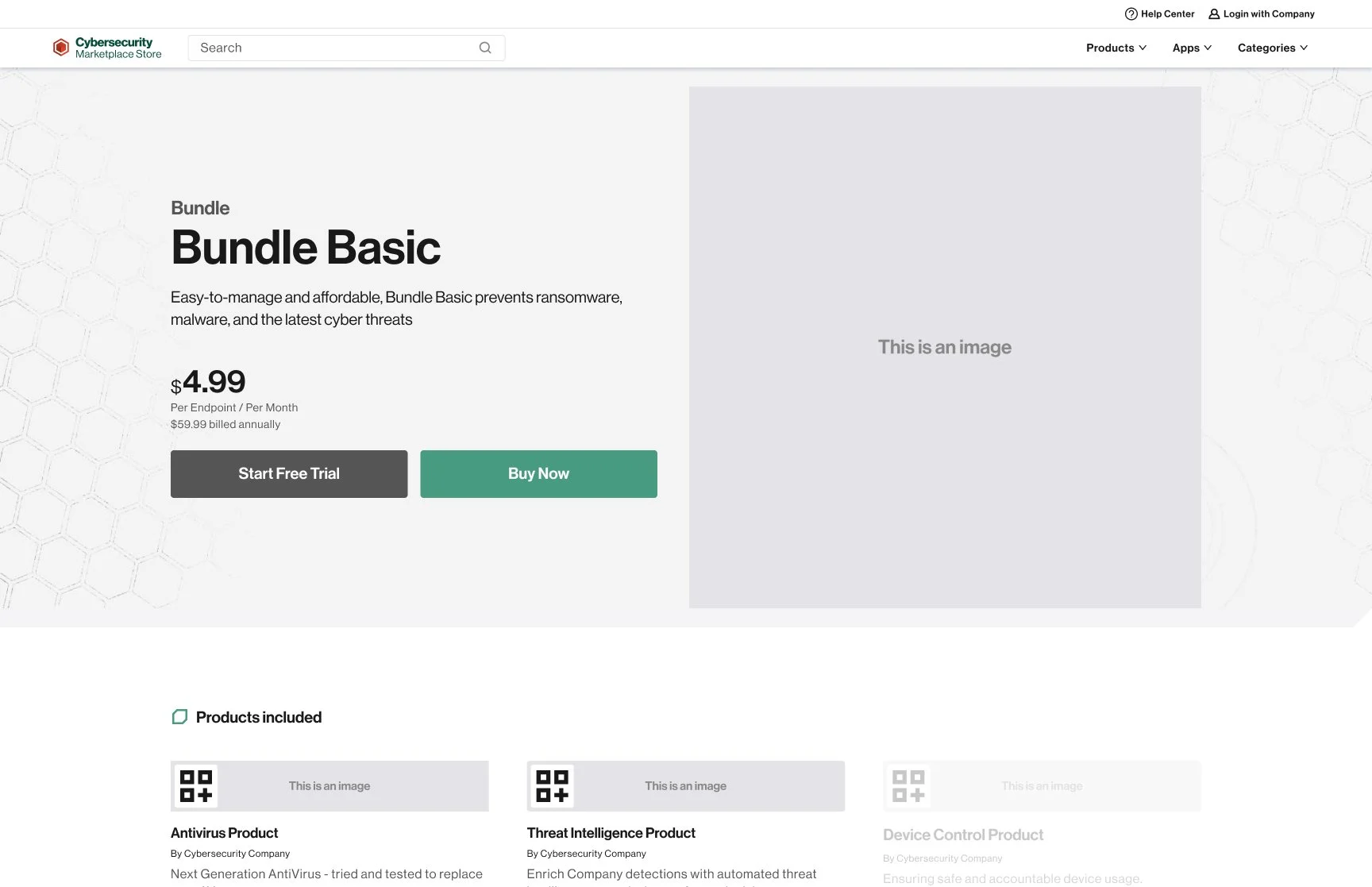
The goal of the tabs layout (which can be seen in the images below) was to break up the payment process into mentally bite sized chunks for users so that they can process one thing at a time.


The next layout was the all-in-one layout. The goal of this layout was to have the user proceed down the page, again in bite sized chunks so that the cognitive load is not high at each stage. This design is more mobile friendly,


The third layout was what I call the sidebar layout. This design was a thought experiment of not going to another page, but instead starting the checkout experience right after the cart. However, this design lost a lot of context after the cart was removed from P1, and also this design was not as common in websites. As a result, I eliminated this layout as an option.


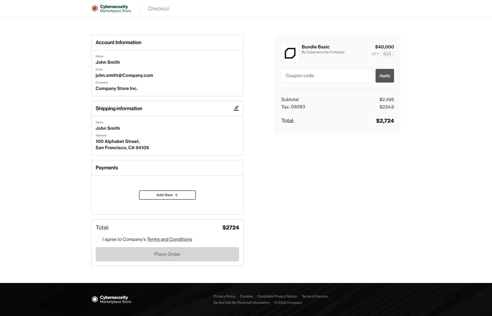
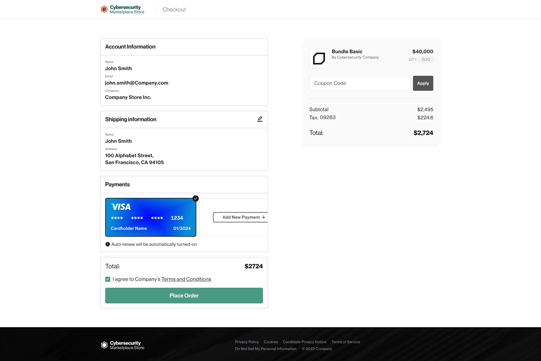
I went with the all-in-one layout in the end as it was the most mobile friendly for me, and there was a logic of building on each other, rather than completing and disappearing with the tab layout. At this point I met with the visual designer and developers to communicate the design goals and intentions, and worked closely with them to implement the design.
final design
Designs have been edited to remove all company branding and products.
New customer


Existing customer


results of the design
42% increase in the quarter’s revenue compared with the previous year
There was a 100% success rate in our usability test as all users were able to check out successfully
Concluding thoughts
What would I change?
I would have pushed to ship earlier, as the project was needlessly delayed
What I have learned
Sometimes due to unfortunate circumstances designs have to be changed and so as Bruce Lee put it succinctly, “Be as water my friend.”