
Introduction
Costco Travel is an Online Travel Agency (OTA) where Costco members can find great deals on flights, cars, hotels, cruises, and rental cars. During my time at Costco Travel I worked on many parts of the website, from redesigning the search widget, the search results page, the rental car pages, and many more.
My Role
While at Costco Travel, I worked as a UX designer supporting multiple development teams.
design process
I introduced a weekly design review meeting for the design team.
design execution and validation
I design user journeys, wireframes, and prototypes for a responsive website.
Customer insights
I work closely with the user researcher on usability tests, personas, A/B tests, and user interviews.
Experience strategy & vision
I would show how designs could be scaled for the future.
Stakeholder management
I presented weekly design updates to the leadership of Costco Travel for the search widget project.
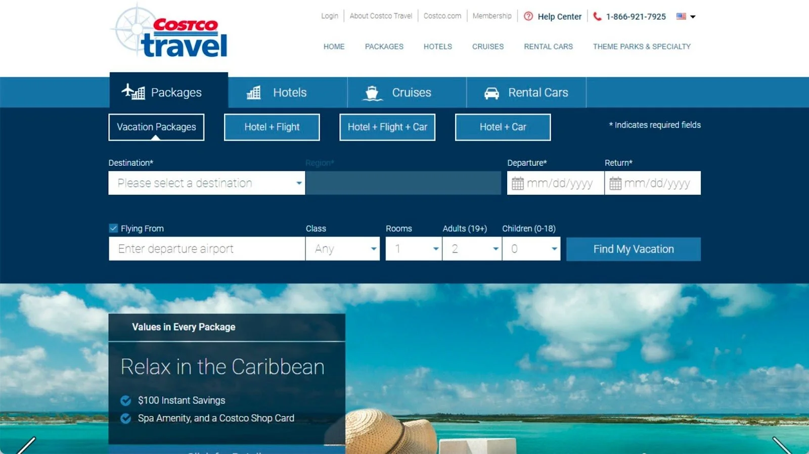
Search Widget Redesign
before (left) & after (right)

Total Time
2 Months
Background info
The search widget redesign was the initial part of a broader search widget and search results page overhaul to improve the overall searches from the search widget on www.costcotravel.com. Business wanted to increase searches for Hotel + Flight (H+F) / Hotel + Flight + Car (HFC) / and Hotel + Car (HC) as they saw this as a potential high growth area for the company.
problem being solved
What factors are contributing to a lower search rate for users and what quick fixes can be done to address this?
Goals
Business goal: Increase searches for HF/HFC/HC
User goal: Reduce the amount of cognitive load needed to search for HF/HFC/HC
Target user
The target user of this project were users who were currently not using our search because it looked too intimidating or complicated to fill out.
Design constraints & challenges
Stakeholder management - dealing with the CEO and COO on a weekly basis, in addition to head of business and their direct reports
Uncertainty around the scope of the project due to business “solutioning” in the beginning of the project
This would be the first A/B test ever done in the history of the company
Missing metrics
Competitive Research
I did a competitive analysis of 9 other competitors by running multiple user tests on usertesting.com. For each test I had users complete a task on three different websites, of which Costco Travel was always one of them. After the task completion, I asked users a set of questions to determine ease of use among the three websites. I found out the following things:
Costco Travel had the most amount of distinct fields to fill out for Hotel + Flight versus our other 9 competitors
Users perceive our search widget to be harder to complete than our main competitors
Some users had issues with how our “Flying from” and “Destination” fields were reversed compared with our competitors
The carousel below the search widget distracted users with a larger monitor
Users were unable to differentiate between vacation packages and HF/HFC/HC packages


Hypothesis
Increasing the color contrast between the package options and the background will allow users to perceive our search widget as easier to complete and more likely see the default selection from vacation packages and change it.
Ideation & user testing
I started my ideation phase by by sketching possible ideas for how the search widget could look like with an increase in color contrast and reduction in distinct fields. I wanted to start with a north star that we could slowly iterate towards, while constantly testing with users to make sure that it made sense. I explored three different “macro” layouts and then user tested them against each other on user testing.com


Adding Colors & user testing again
Then I iterated on the winning layout with multiple versions of what it could look like in different colors, photos, and different hierarchies of fields. I then again ran them against each other on usertesting.com to get an understanding for what our users thought.

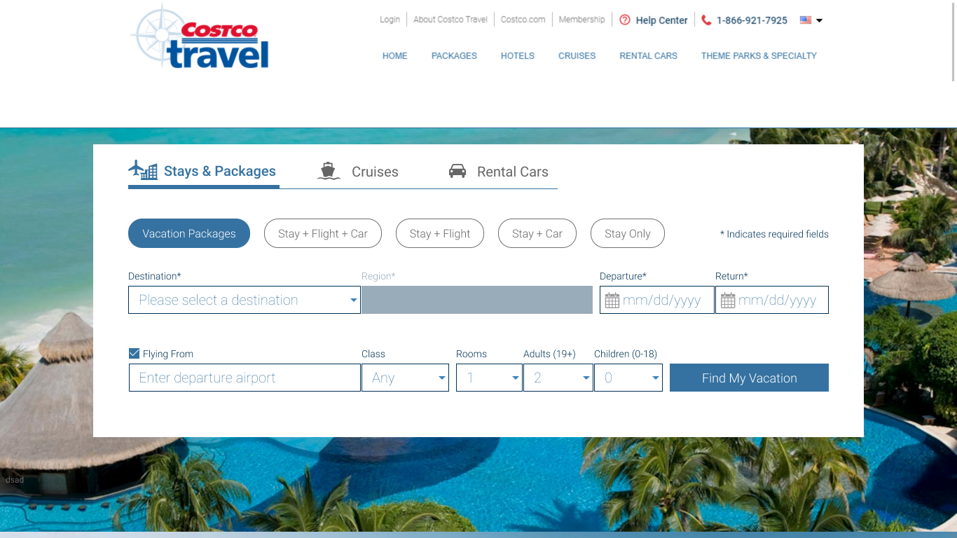
This option tested well and was chosen to be the B in the upcoming A/B test.

A/B test Success Metrics
I worked with the PM to determine what the success metrics for what the design should be for the A/B test that we were going to run. We decided on the following with the stakeholders confirming:
Increased HF/HFC/HC searches by 2%
Maintain percent of vacation packages searched
Maintain the conversion rate from vacation packages and HF/HFC/HC searches
final results of the a/b test
Increased HF/HFC/HC searches by 5.62%
For every 1 million sessions we would see an increase of 56,00 searches for the HF/HFC/HC section of the search widget
Maintained percentage of vacation packages searched
Maintained the conversion rate from vacations packages and HF/HFC/HC searches
Concluding thoughts
What would I change?
I would have worked sooner with the stakeholders to establish user and business goals
I would have fought to do an A/B test with the design that tested the best
I would have pushed harder for a 50/50 A/B test, especially when the user tests indicated no usability issues
What I have learned
Comparing current metrics to previous years and time periods is hard during a pandemic, and thus the A/B test metric was the best one to look at in this context
Search widget - hotels
before (left) & after (right)


total time
2 Months
background info
Business wanted to increase the searches for hotels in the search widget.
problem being solved
Some users indicated confusion around the “Flying From” checkbox and would mistakenly think that they should check it.
goals
Business goal: Increase searches for Hotels
User goal: Eliminate user confusion around the hotel search experience and make it easier for users to add a car or flight (or both)
target user
The target users of this project were users who were currently not using our hotel search because it looked too intimidating or complicated to fill out, and users who were confused by the “Flying From” fields.
success metrics
Business and I decided on a 5% increase in hotel searches to be our success metric especially after our last success with the search widget redesign.
design constraints & challenges
Stakeholder management
Uncertainty around scope
Second A/B test
Missing metrics
hypothesis
Redesigning the “Flying From” section would eliminate confusion from users and increase searches for hotels.
ideation

I had already wanted to redesign the hotels tab of the search widget to reduce the cognitive load on users. As a result, I wanted to reuse this design from before.
hi-fi mockup & user testing
I ran a usability test on usertesting.com and 100% of users preferred the new design.
It reduced the options to only what was needed, decluttered the page, and had an overall straight-line appearance.
- Research Participant
Option B only asked for and provided the information I was looking for, the hotel. Option A made me feel like I have to look for flight and car as well.
- Research Participant


final results of the a/b test
Increased hotel searches by 8.32%
For every 1 million search sessions we would see an increase of 83, 200 searches for the hotels section of the search widget
Increased the percentage of hotel searches that moved on to the hotel search results page by 9.11%
For every 1 million search sessions we would see an increase of 91, 100 users progressing to the hotel search results page
Maintained the conversion rate from vacations packages and HF/HFC/HC searches
concluding thoughts
What would I change?
I would have pushed harder for a 50/50 A/B test, especially when the user tests indicated no usability issues
What I have learned
Comparing current metrics to previous years and time periods is hard during a pandemic, and thus the A/B test metric was the best one to look at in this context
Even though the better testing design in the first project may have been rejected in the past, that doesn’t mean it cannot be slowly implemented bit by bit