03 · Costco Travel · Search experiments · 2020–2022
Making travel search look as easy as it is.
Costco Travel’s search form looked complicated to fill out, even though it asked for only one more field than competitors. In usability testing, people also read the optional flight fields on the hotel tab as part of the search. I redesigned the search in two phases. I first reorganized the package search to make it easier to understand at a glance. Then I placed the optional flight and car choices below the hotel search fields.
Results from the A/B tests
+5.62%
Hotel + Flight, Hotel + Flight + Car and Hotel + Car searches · Phase 1
+8.32%
Hotel searches · Phase 2
+9.11%
Progression to hotel search results · Phase 2
Conversion held steady in both tests. In Phase 1, the share of vacation-package searches held steady too.
Phase 1 · Package search
Lowering the cognitive effort of the search widget.
The search widget asked for only one more field than competitors’ widgets, but at a glance it looked like a wall of dropdowns. Product tabs, four package choices and many fields competed for emphasis, so the form signaled more effort than it took.
Before: a wall of dropdowns
Original package-search widget. All four package choices already existed; the redesign changed their hierarchy and presentation.

I reviewed analytics, compared nine travel sites and explored different layouts. The goal was to lower the cognitive load of that first look, so a traveler could see the form and expect it to be quick to fill in. I selected a direction that grouped the package choices above the search fields on a lighter surface, with a filled selected option and outlined alternatives. Destination and dates sit above departure airport and traveler details.
After: the selected package direction
Selected Phase 1 direction: package choices grouped on a lighter surface, one clear selection and labeled fields below.
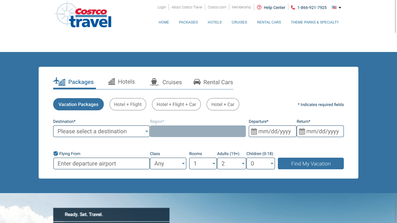
Usability testing informed the hierarchy, and the direction moved into an A/B test focused on Hotel + Flight, Hotel + Flight + Car and Hotel + Car searches. Those searches rose 5.62%, while conversion and the share of vacation-package searches held steady. A hotel-first concept from this phase was set aside for later.
Phase 2 · Hotel search
A hotel-only task looked like it needed a flight.
On the hotel tab, the unchecked “Flying From” option and its grey fields occupied much of the second row. A package promotion also appeared above the search fields. Someone looking for a hotel could interpret flight information as part of the task, even though the option was unchecked.
Before: flight fields beside the hotel task
Original desktop hotel-search design. The usability finding concerned travelers reading the optional flight fields as part of the task.
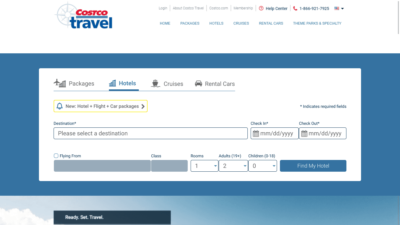
I returned to an earlier hotel concept that had been set aside during the package work. It fit the narrower question in this second phase: could someone recognize how to start a hotel-only search, while still finding flight and car options when they needed them?
After: hotel details first, additions below
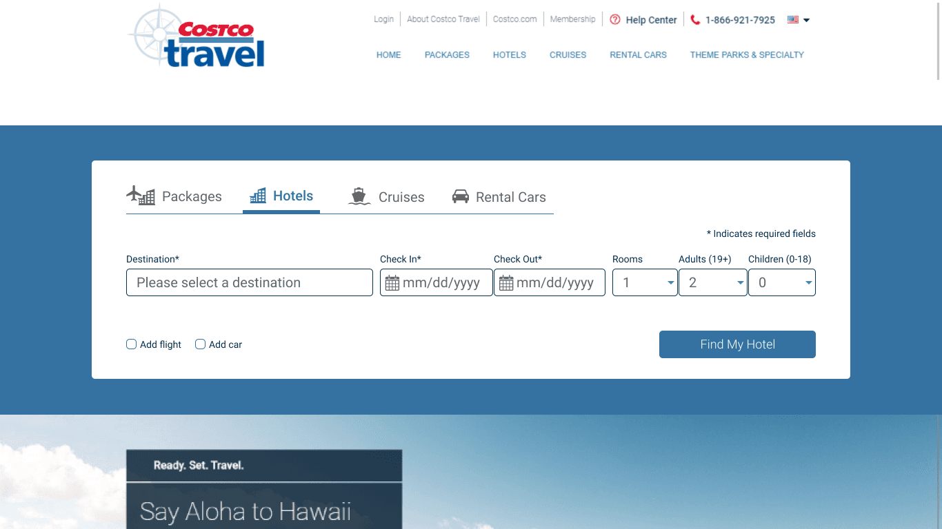
Selected direction for the hotel experiment. Original desktop design.
- Keep the hotel task together
- Destination, check-in and check-out dates, rooms and travelers form the primary row.
- Make an addition an explicit choice
- “Add flight” and “Add car” appear below the hotel details. The hotel search action remains visible. These default states show the intended distinction.
In its A/B test, hotel searches rose 8.32% and progression to hotel search results rose 9.11%, while conversion held steady.
Collaboration and constraints
What we could change within the existing site.
The redesign had to preserve the site’s travel products and work within its responsive layout. I worked with product, engineering and business partners on changes the team could take into experiments. Grouping, labels and emphasis gave us a way to examine a specific search decision without rebuilding the whole search experience.
Delivery and results
Two designs, two separate experiments.
With these two experiments, I introduced A/B testing to Costco Travel’s search.
Next: the design system behind this portfolio →