04 · Self-directed design practice
Using AI to build a portfolio I can maintain.
I wanted a portfolio for AI experience roles and more practice building with AI, so the portfolio became the project. I worked with AI tools to turn my personal style into a style guide, then to build and maintain the site from it.
Why I built it
Practice on something real.
I needed a portfolio for AI experience roles. I also wanted more hands-on experience using AI as a design tool: building a style guide and keeping it consistent as the content changed. My own portfolio was a real project to do that with.
I wanted the cases to come from work I could stand behind, so I had the AI read my two story banks and my project source folders before drafting anything. It compared candidate projects; I approved the final four and their order.
I then asked it to work out what hiring managers for the AI UX roles in my job tracker would look for. It proposed a shared rubric, questions tied to each job description and a Courtroom-style review for disputed conclusions, then ran that review on the drafts.
Design criteria used in the review
- Audience and task: find relevant AI interaction work and understand my role.
- Evidence and ownership: distinguish original artifacts, reconstructed explanations and proposed work.
- Behavior: make the current state, next action and recovery clear.
- Access: consider keyboard use, text size, contrast, reflow and image alternatives together.
- Visual system: make the reading hierarchy and repeated elements consistent.
- Maintenance: update the evidence and review the surfaces that use it.
The style guide
Written for people and AI to read.
The style guide lives in Markdown files, so any AI tool can read it and follow the same rules. I used AI to write the core guide from my own fashion sense and design principles, then to build the site from it.
What the files hold
- The core guide
- Identity, principles, color and type tokens, layout, components, states, motion and accessibility rules, with a version number and changelog for every edit.
- Supporting guides
- A start-here file, reference, patterns, examples, voice, a review checklist and a guide to avoiding generic AI design.
- Site files
- A token file the code is checked against, component notes and a handoff file that records each change.
Because the rules are written down, every new AI session starts from the same source, and I can switch tools without losing the thread.
Visual identity
How my fashion sense shaped the site’s design.
I wanted the site to feel like me, so the style guide starts from my fashion sense and the materials I am drawn to. Each part of that language became an interface rule.
From fashion language to interface
- Dark artisanal Japanese tailoring
- Near-black surfaces, precise type and restrained structure.
- Washed black and patina
- Several cool near-black surface levels instead of one flat black.
- Oxidized silver
- Fog-blue accents and cool borders.
- Soft Summer color
- Grayed, cool, low-chroma color throughout.
- Monastic calm
- Calm pacing, minimal chrome and one focal point at a time.
Night Archive palette
Archive Black for the canvas, three cloth-like surface levels from Sumi to Iron Panel, Paper Ink for text and Deep Fog for links and selection.
Accessibility was part of the palette from the start: every text and control color was paired with its surface and tested for contrast.
Typography and hierarchy
One typeface for reading, one for evidence.
Instrument Sans · headings and body
Using AI to build a portfolio I can maintain.
I use Instrument Sans for both headings and body text. The body text is generally 17 to 18 pixels, with paragraph widths that adapt to the page.
IBM Plex Mono · labels and sources
Source · IDC PlanScape · page 3
Mono marks what the system knows: dates, sources, stages and labels. Keeping it to short labels makes it a reliable signal.
The hierarchy follows one rule from the style guide: one obvious focal point per screen. Large sentence-case headlines carry the argument, a quiet label rail names each section, and supporting detail sits in captions or behind a Show/Hide disclosure.
Components
A small set of parts, reused everywhere.
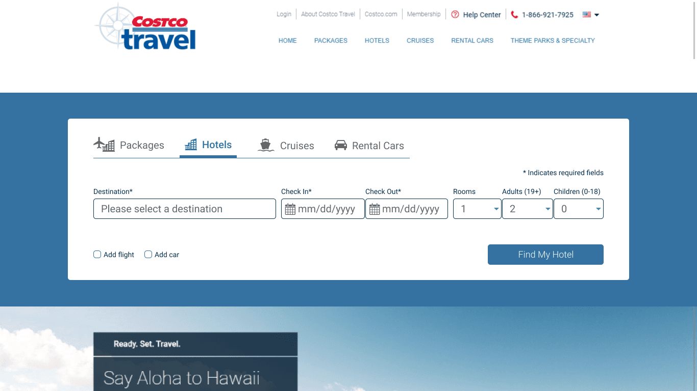
Every page is built from one Framer code component, so the same structure repeats across the case studies. Cases with original images use an evidence viewer that shows a cropped view and lets the reader enlarge it or open the full image, with the original pixels intact. Collapsed sections use a disclosure with a visible Show/Hide label.
The evidence viewer, live
The same viewer the Brevity, Costco and Roadside cases use, here showing the Costco hotel-search redesign. Enlarge it, then pan with a mouse or the arrow keys.
State labels from the Lumen workflow.
Color adds emphasis; the wording identifies the state.
Accessibility
Accessibility standards built into the component.
The style guide targets WCAG 2.2 AA, with a few AAA choices where they make the site easier to use. Each rule is built into the component, so every page inherits it.
Standards followed
- Contrast · 1.4.3, 1.4.11
- Text meets 4.5:1 and control borders 3:1 against their surfaces. Body text reaches about 17:1.
- Use of color · 1.4.1
- Every state has a text label; color adds emphasis.
- Keyboard and focus · 2.1.1, 2.4.7
- Every control works from the keyboard, with a visible focus ring. The evidence viewer pans with the arrow keys.
- Structure · 1.3.1, 2.4.1
- Semantic headings and landmarks, and a skip link to the main content.
- Target size · 2.5.5 (AAA)
- Controls are designed around 44 pixels.
- Reflow and motion · 1.4.10, 2.3.3 (AAA)
- Pages reflow to 320 pixels wide without sideways scrolling and honor reduced-motion settings.
- Images · 1.1.1
- Every original artifact has a written description.
Color tokens and contrast are checked automatically with every change. Layout is checked at phone widths and in Framer’s breakpoint frames.
Human in the loop
What I caught when reviewing the AI’s work.
AI drafted the copy, wrote the code and ran the checks: color tokens, contrast and layout at phone widths. I reviewed every page in Framer and decided what changed. Several of the most important fixes came from that review.
- Broken breakpoints. In Framer, I found the phone layout broken even though every check had passed. The checks had looked at real phone widths, while Framer’s canvas draws the phone frame inside a wide editor window. The AI traced the cause, changed the layout to respond to the component’s own width and added two checks that reproduce the canvas. I confirmed the fix in Framer.
- Sections that looked empty. I read collapsed sections as empty headings. Every disclosure now shows a Show or Hide label, and the style guide now requires one.
- An extra step. The AI built an interactive review tool for the Lumen case. I removed it, because it added work instead of fitting how the team already worked.
- Copy that hedged. Drafts kept listing what each project was not. I had the copy rewritten to state plainly what happened.
Maintaining it
How I maintain the portfolio.
- Add a new artifact, correction or target role to the source folder.
- Compare it with the claim record. Resolve conflicting dates, ownership and outcome claims.
- Change the affected case and any index copy that depends on it.
- Check keyboard access, links and layout at device widths and in Framer’s breakpoint frames.
- Review the result in Framer before it goes live, and log the change in a handoff file so I can switch AI tools without losing context.